Celtic Connections
As well as the designs that we present in our portfolio there are many more great concepts that remain in our archives. These two concepts were part of an unsuccessful creative pitch for Celtic Connections
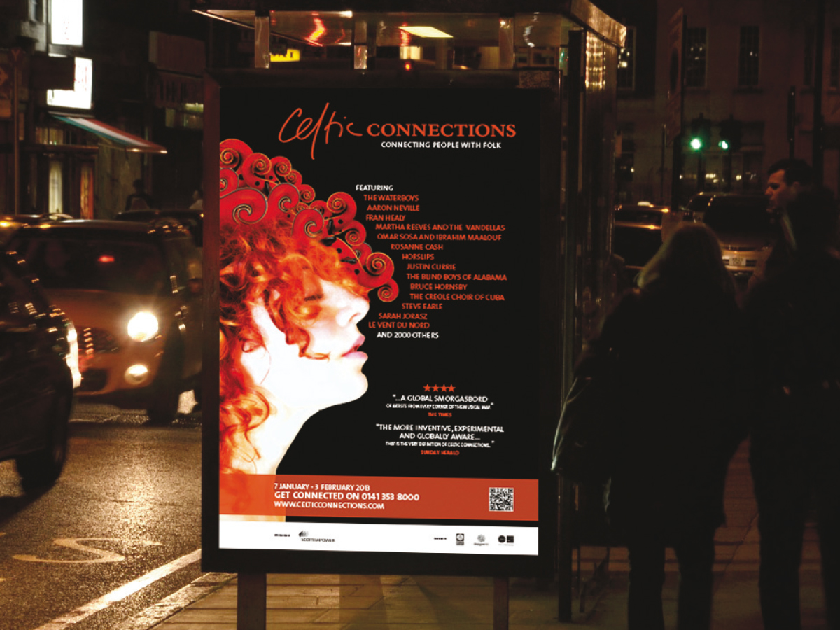
Route 1 – ‘Connecting People With Folk’
Simple but effective play on words and bang on what Celtic Connections is about.
We use a fiery redhead. She is affected by a musical experience, visualised by her hair flowing and merging into
mandolin, cello and fiddle scrolls (the scrolls can be narrowed down to just one kind or expanded to several styles).
The overall impression is one of complete connection.
The colour scheme of red against black reflects the heat of the festival against the cold winter nights. The overall
effect being one of excitement and welcoming.
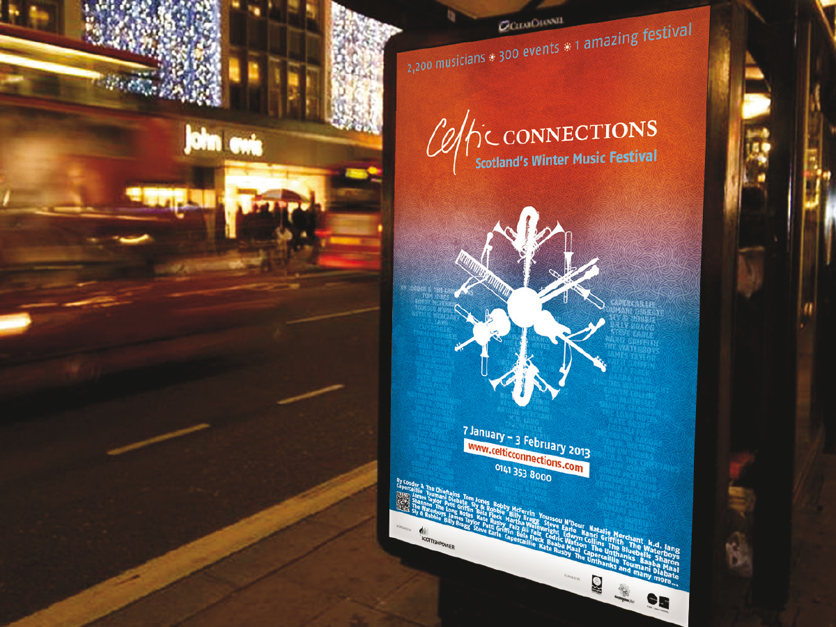
Route 2 – ‘Scotland’s Winter Music Festival’
Highlighting the broader scope of the festival.
Contrast of colours from winter blue to burnt sienna giving warmth and the textured background maintains a subtle
celtic link through a celtic themed pattern.
The SNOWFLAKE composed of musical instrument silhouette’s provides a quirkiness to the visual and reinforces
the winter festival theme established in the tagline. The snowflake can be positioned in a variety of ways providing
flexibility across different formats.


