

World Pipe Band Championships
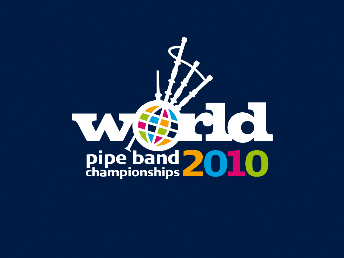
As well as the designs that we present in our portfolio there are many more great concepts that remain in a lonely folder in our archives. Here is a logo we created as part of an unsuccessful creative pitch to update the World Pipe Band Championships logo.
- MORE COLOUR to better illustrate colourful nature of event and range of nations – and an increased family feel
- VARIATION ON GLOBE THEME to provide more eye catching icon and allow for use of more colour
- USE NEW TYPEFACES but in similar layout as previous logo to help maintain established brand recognition
- FURTHER STYLISING OF LOGO AND PIPES ILLUSTRATION to create a stronger festival/celebratory image
- SIMPLIFICATION OF PIPES ILLUSTRATION to gain clarity for use on screen and at small print sizes
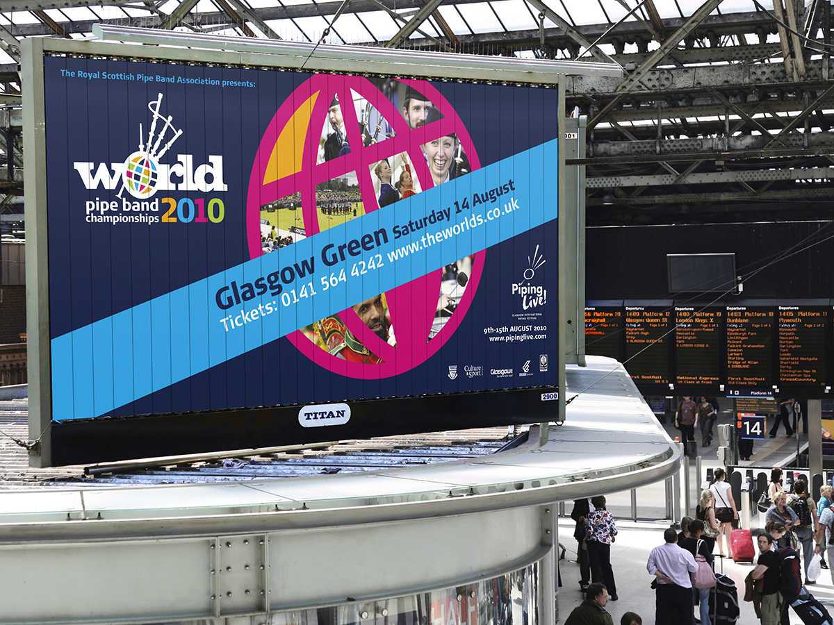
- POSTER: USE LOGO AGAINST DARK BACKGROUND for maximum visual impact
- GLOBE ICON utilised as the main focus and provides a strong frame for photos and colours
- MULTIPLE IMAGES can be used in the globe to cover all the different elements of the event
- SIMPLE BUT FLEXIBLE overall design provides a good base for producing other items